In modern commercial spaces—retail stores, restaurants, hotels, and workplaces—lighting shapes how we experience our surroundings. Color temperature has become one of the most powerful tools available to designers and LED lighting suppliers in Singapore and beyond. It influences not just visual aesthetics, but emotions, decisions, and behaviors. As LED technology advances, designers now have precise control over color temperature, transforming it from a specification into a strategic design element. For businesses working with commercial lighting solutions, understanding color temperature is essential for creating environments that are both beautiful and psychologically responsive.
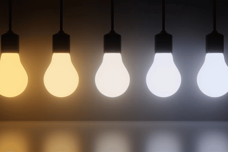
In commercial environments, light is no longer viewed simply as a way to make a space visible. Today, color temperature has become an influential design variable that shapes how people read a space, how long they stay, and even how they behave. Color temperature—expressed in kelvins—defines whether light appears warm, neutral, or cool. More importantly, it sets the emotional tone of an environment. A warm 2700K glow suggests comfort and intimacy, while cooler 5000K lighting communicates clarity, alertness, and energy. These perceptual cues may seem subtle, but in reality, they form the backbone of how users interpret and interact with modern built environments.
Because LED technology now offers precise control over correlated color temperature (CCT), designers can shape experience with far greater accuracy than ever before. This is why terms such as color temperature LED, LED downlight color temperature, and LED wall color temperature have become central to the way we discuss commercial lighting performance today.
Human perception of color temperature is deeply rooted in both biology and psychology. Our visual system continuously performs chromatic adaptation, adjusting to the color of surrounding light to maintain stable color perception. This means different color temperatures can influence how we evaluate surfaces, materials, and even facial expressions.
At the same time, the circadian system interprets color temperature as a signal of time and activity. Cooler light with higher CCT tends to trigger alertness and cognitive focus because it mimics the spectral qualities of daylight. Warmer light encourages relaxation by engaging the body’s evening-associated hormonal cues. These mechanisms help explain why people respond instinctively—and often predictably—to different lighting conditions without conscious awareness.
Spatial brightness perception also plays a significant role. Two spaces with identical light levels can feel entirely different depending on their color temperature. Cooler light often appears visually “brighter,” while warm light can soften edges and deepen material tones. These sensory responses form the scientific foundation for using color temperature as a design tool.
Because color temperature is tied to psychological and physiological reactions, it naturally becomes a driver of behavior in commercial settings. Warm lighting encourages slower movement, longer dwell time, and a greater sense of comfort. Neutral-white tones help users perceive objects more accurately and evaluate details with confidence. Higher CCT lighting stimulates alertness, makes tasks easier to complete, and enhances cognitive engagement.
This is why color temperature is so influential across commercial categories. In hospitality, warm light supports emotional connection and a relaxed environment. In retail, neutral color temperatures help customers perceive material accuracy while subtly guiding their attention to key visual elements. In workplaces, cooler tones stabilize circadian rhythms and improve task performance. While each context has different goals, the underlying behavioral mechanisms remain consistent: light influences how people feel, and feeling influences how people act.
As research continues to reveal the deep connections between light, behavior, and wellbeing, color temperature will remain central to the evolution of commercial design. The question is no longer whether color temperature has an impact—it is how thoughtfully we choose to apply it. When handled with care, color temperature allows designers to create spaces that are visually coherent, emotionally supportive, and aligned with human biological rhythms. Its influence extends far beyond aesthetics; it defines experience.
Lv, Q. (2025). Intelligent building design based on green and low-carbon concept. Energy Informatics, 8(1), 1-18.
Illuminating Engineering Society. (2020). RP-2-20: Recommended practice for lighting retail environments. Illuminating Engineering Society.
International WELL Building Institute. (2023). WELL building standard v2: Light concept. https://standard.wellcertified.com
Mills, P. R., Tomkins, S. C., & Schlangen, L. J. M. (2007). The effect of high correlated colour temperature office lighting on employee wellbeing and work performance. Journal of Circadian Rhythms, 5(1), Article 2. https://doi.org/10.1186/1740-3391-5-2
Ryu, K., & Jang, S. (2007). The effect of environmental perceptions on behavioral intentions through emotions: The case of upscale restaurants. Journal of Hospitality & Tourism Research, 31(1), 56–72. https://doi.org/10.1177/1096348006295506
